Dr. Mecenovic
Rechtsanwalt GmbH
2023
Art Direction
Rebranding
Print Design
UX/UI Design
Web Design
Photography
Client
Client
Year
Services
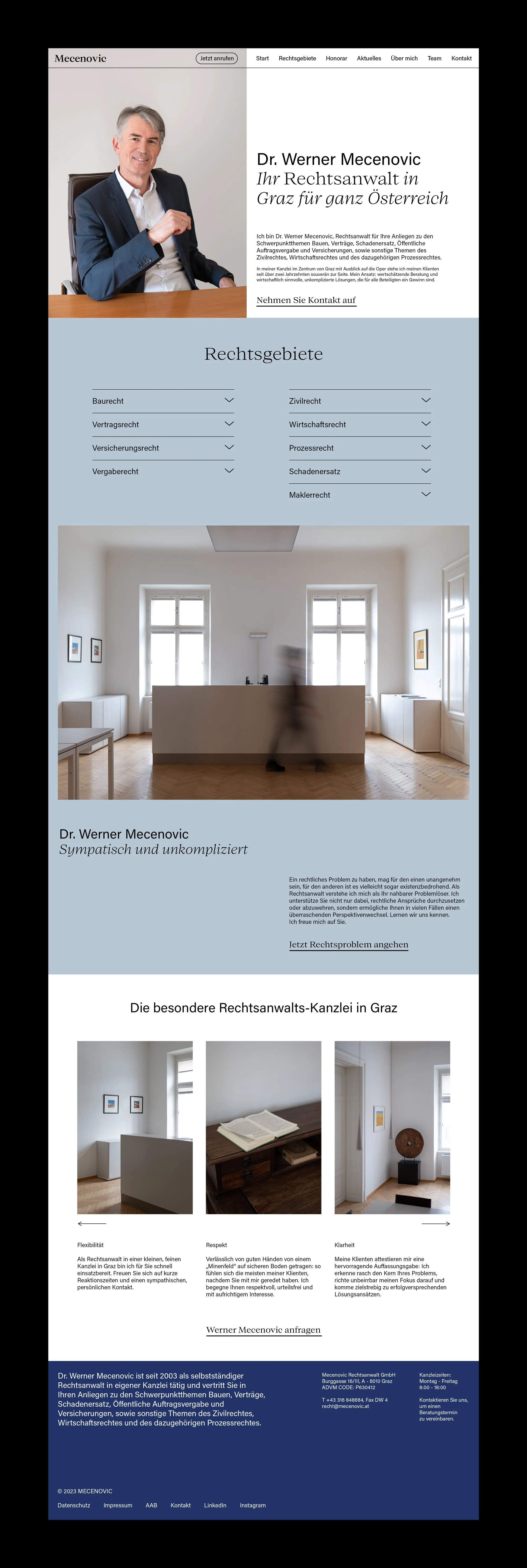
Dr. Werner Mecenovic is a law firm based in the city center of Graz with a specialisation in construction, contract, insurance and civil law. With over two decades of experience the firm’s main approach lies within appreciative legal advice and economically sensible, uncomplicated solutions.
Rebranding Strategy
ChallengeWith over 20 years of experience, Dr. Mecenovic sought to rebrand his firm to enhance his professional image and set himself apart from competitors. The previous branding felt impersonal and generic. The challenge was to develop a timeless, yet personal brand identity that would both reflect Dr. Mecenovic's unique approach to legal advice and convey his expertise and competence.
SolutionA competitor analysis was conducted to redefine the target audience and identify key elements for the rebranding and UX/UI redesign of the new website. The previous branding utilised sans serif fonts predominantly. For the rebranding, a blend of serif and sans serif fonts was chosen to strike a balance between a modern and timeless aesthetic. Additionally, the use of italic and regular styles within the serif font provided subtle, yet effective accentuation in text.
Dr. Mecenovic, who prefers the traditional method of writing with paper and pen, influenced the branding details. This personal preference was reflected in the name logo, which features unique serif embellishments. This preference was also further extended to the website's user interface through a custom link hover transition, mimicking the act of underlining words with a pen in reverse.
The color palette draws inspiration from the target audience in the construction and real estate sectors, and the visual connection to concrete. It aims to embody Dr. Mecenovic’s core traits such as calmness, assertiveness, excellence, sophistication, clarity and simplicity.
Photography was utilised to further enhance the brand experience, featuring detailed shots that convey a timeless, professional look. The images also highlight the unique office spaces located on the third floor of a 200-year-old building in the historic center of Graz, which offers a spectacular view of the Opera house and the iconic "Light Sword" steel sculpture by Hartmut Skerbisch.
Building on this new brand identity, the UX/UI and web design for Dr. Mecenovic's new website were created, focusing on a clear and harmonious user experience.
UX Design
The original website for Dr. Mecenovic was designed as a static one-pager, resembling a digital poster more than a dynamic, informative website. It lacked interactive elements and focal points, making it less user-friendly. Additionally, Dr. Mecenovic desired a website that felt more authentic, personal, and approachable, helping to alleviate the often overwhelming experience associated with legal matters. The objective was to develop a welcoming and accessible website that not only reflects Dr. Mecenovic's unique legal approach but also provides a clear, intuitive user experience to efficiently navigate through the various legal services offered.
User Segment
As part of the rebranding a competitor analysis was conducted with the client. This helped redefine the target audience and identify key elements (goals, frustrations, motivations) in order to structure the new website's navigational architecture and ensure a more cohesive user experience.
Sitemap
The original website featured a very linear structure, lacking focused actions or variety in access points. In contrast, the new website was thoughtfully developed to include multiple access options, such as a landing page and menu-based navigation that organises content around established key elements. This redesigned architecture also focused on cross-linking of content in order to provide a seamless user experience without dead ends. Most pages feature additional links to the contact page. To facilitate easy and direct contact, a CTA button was implemented to the main navigation enabling to call the office and an additional CTA button for emailing within the mobile navigation menu.
Wireframes
The sitemap acted as a blueprint for developing data-driven, low-fidelity wireframe designs which were further refined through prototyping and usability testing.
UI Design
A UI Style Kit was developed for the website, adhering to the established branding guidelines and wireframes. It focused on two main components: buttons for CTAs and links for cross-linking content between pages. To highlight and distinguish links within the text, a custom hover-over effect was implemented, mimicking the act of underlining words with a pen in reverse.
Web Design
The new website features a minimalist and clean design, enhanced by the playful placement of photography and background colors that add a subtle dynamic to the user experience. To maintain a clear, uncluttered look and prevent text-heavy sections, accordion structuring has been applied to dense textual areas. Additionally, links to the contact page are consistently provided across all subpages, ensuring a quick and straightforward method for users to reach out to the law firm.


